SaaS
say goodbye to clunky impact measurement indicator setup—b.world’s new release gets you to results sooner
Author: Adina Fudym, Product Manager and UX/UI Designer
2 mins read

We’ve been working steadily to improve b.world so it continues to add value to your workflow.
Because we follow a user-centered design methodology, we not only listen to what our users have to say but also take their feedback to heart and recognize that a change is required when we hear the same feedback from multiple people. Moreover, we make inferences based on what users aren’t telling us (aka reading between the lines). To that end, we are constantly hearing ‘oohs’ and ‘aahs’ about b.world’s Whiteboarding and Stories modules (because who doesn’t love interactive tools where you can play with AI?), but no one has ever oohed and ahhed about setting up indicators and getting data into b.world’s Logframe. Moreover, some have bemoaned that it takes too long to see value from using the platform because there’s too much setup work and data transformation that must be done before reaping the tool's benefits (e.g., calculating and seeing the aggregate impact).
While indicator setup and data entry are “boring,” it’s still essential, so we challenged ourselves to make this process less painful, daunting, and time-consuming. That’s what this release is all about: getting from project creation to results much more quickly.
Impact Measurement Indicator Setup
Pre-selected Popular Defaults
Previously, the most significant barrier to data entry was the requirement to set up each indicator one by one; a grayed-out indicator on the Logframe screen indicated that it hadn’t yet been set up, and you couldn’t access its data table until it was. One solution to expedite setup could have been a bulk setup, whereby users could set up multiple indicators at once. But what if we didn’t require setup at all?
We achieved this by pre-selecting the most likely default settings, with the only unpopulated requirement being ‘Unit of Measurement.’ Now, it’s possible to access each indicator’s data table without a laborious setup process.
All indicators in the Logframe are accessible from the start, as denoted by their black font.
There are only five required fields, and only one of them (i.e., Unit of Measurement) doesn’t yet have a default value.
Set up and Data Entry in One Place
Previously, indicator setup was required for data entry, so the setup screen was in a different location than the data entry screen. However, this made it more time-consuming to navigate between setup and data entry, a necessary capability:
1) if you’re looking to make changes to your setup during the course of data entry (e.g., adding dimensions or stakeholders), or
2) while examining your data table, but before you’ve entered any data (e.g., adjusting reporting frequency). Now, data entry and indicator setup live on one screen; Indicator Setup is a slideout panel on the right-hand side of an indicator’s data entry screen that automatically opens when navigating to the page if no data has been entered for the indicator.
This small change helps streamline the user experience by reducing clicks, page loads, and unnecessary screen transitions.
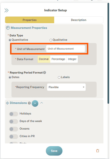
The data entry table and the Indicator Setup panel live on the same screen.
3. Separation of Information
Previously, the entire indicator setup form lived on a single screen. This, in and of itself, isn’t an issue, but having too much information on a single screen can be overwhelming, causing cognitive overload and reducing the likelihood of task completion.
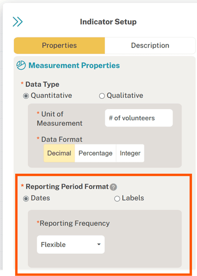
We spent time identifying which fields are most important for data entry—the task at hand—and placed the most important in the primary ‘Properties’ tab of the indicator setup panel, and the less immediately necessary in a secondary ‘Description’ tab. What we landed included Data Type, Reporting Period Format, Dimensions, and Stakeholders in the Properties tab, and Name, Definition, Data Collection Method, and Standards alignment in the Description tab. Within each tab, we prioritized the required or most necessary information at the top and put the other fields beneath.
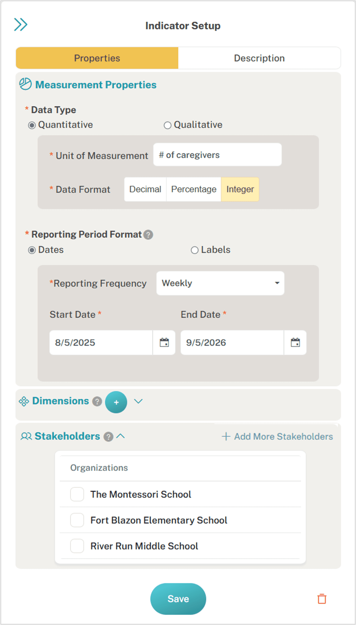
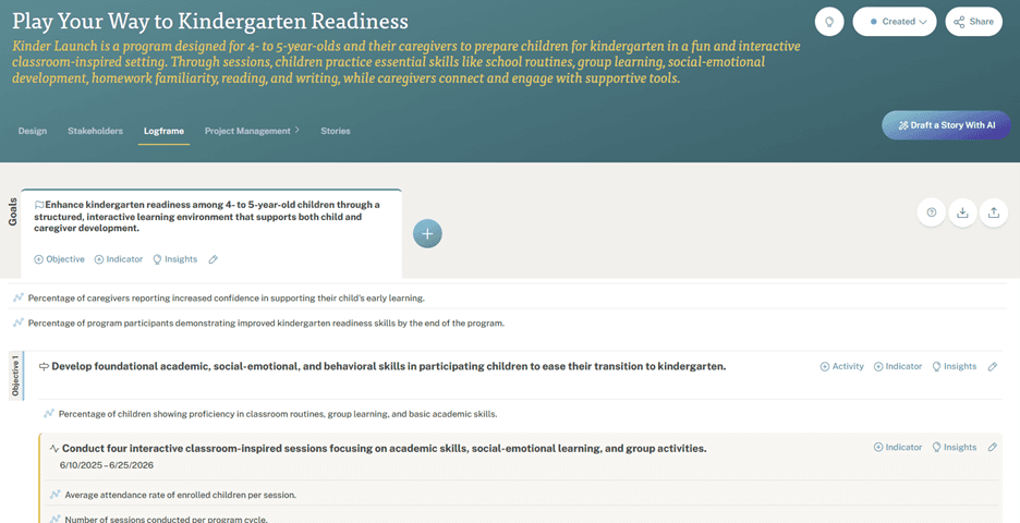
The primary ‘Properties’ tab on the new Indicator Setup panel.
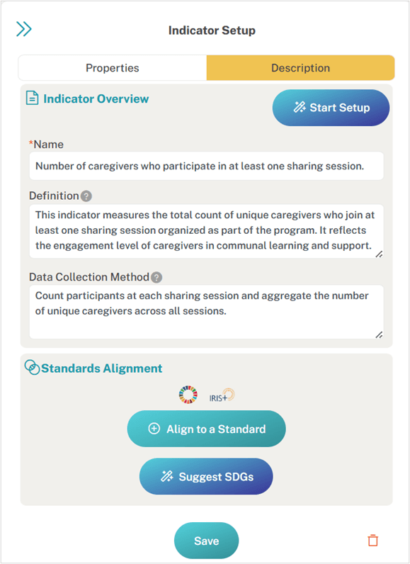
The secondary ‘Description’ tab on the new Indicator Setup panel.
4. Fields, Choices, and Labels Simplified
Another factor that made the indicator setup process burdensome was the number of choices users had to make — some of which they didn’t understand and some of which were honestly unnecessary — and the fields weren’t easily scannable. By removing unnecessary questions and options, grouping information in more logical ways, and adding easily scannable headers, we’ve made it easier and quicker for users to read the Indicator Setup panel.
For example, take a look at the Data/Measurement section in our new design versus our old design. The new design has a brief ‘Data Type’ label, making it clear what the content will be, compared to the old design, which used a question as the field label (i.e., more text) to capture the same information. Moreover, we’ve simplified the initial choice within Data Type: your data is either Quantitative or Qualitative, and if you choose Quantitative, there are only three options—Decimal, Percentage, and Integer—instead of five, because among all five former choices, there were really only three formats.
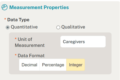
NEW ‘Data’ section design in Indicator Setup, which makes it easier to scan through measurement-related setup choices.
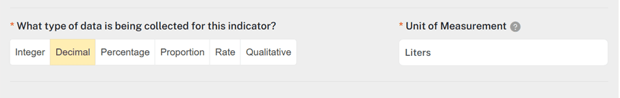
OLD ‘Data’ section design in Indicator Setup.
Additionally, we removed the questions about recording data incrementally vs. cumulatively and whether data could be added together across reporting periods. These questions are only relevant for data aggregation, which takes place in a separate module of b.world—Results. Moreover, users often stumbled through these questions because they were more challenging to comprehend and, therefore, scan.
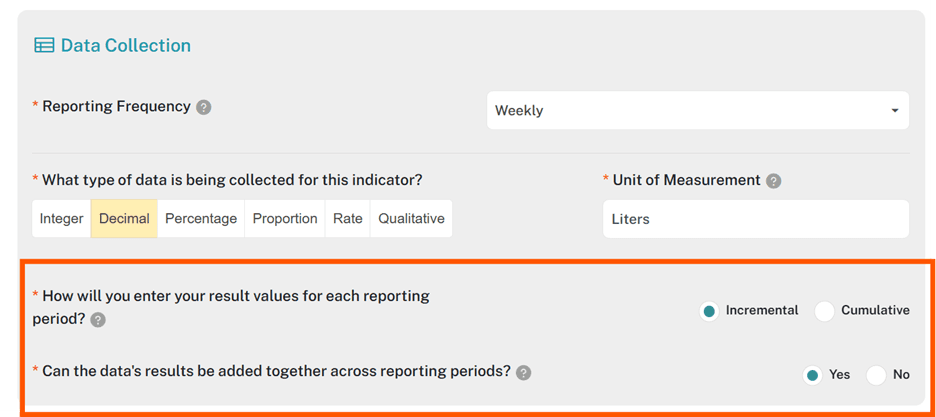
Questions in the old Indicator Setup design that were removed from the new one.
5. A New Impact Reporting Format and Reporting Frequency
…sort of. These aren’t actually net new, but rather riffs on existing options. Within Reporting Frequency, for a long time, there’s been a ‘Flexible’ option so users didn’t have to adhere to a traditional reporting interval if it didn’t suit their organization’s impact measurement practices. However, by selecting Flexible, users lost the ability to choose dates from a calendar, which wasn’t ideal when it came time to aggregate data in Results. To address this issue, we’ve introduced the ability to select one of two high-level reporting formats—Dates or Labels—and added a Flexible option within Dates that lets you choose a calendar-based date for each reporting period. The Flexible Dates option is the default reporting period format when users first navigate to an indicator’s data table page. They can choose to keep this one or select a more traditional interval (e.g., Weekly, Monthly). The ‘Labels’ option works like the old Flexible reporting frequency option, allowing users to define each reporting period however they choose.
New ‘Dates vs. Labels’ Reporting Period Format, with Flexible Dates as the default.
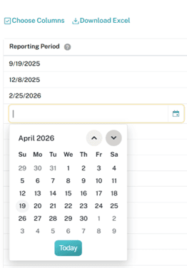
What the data table looks like when Flexible Dates is selected as the Reporting Period Format.
Impact Measurement Indicator Navigation
Another feature that we’ve introduced to streamline the indicator experience is having navigation on the indicator data table screen itself. Previously, users had to return to the Logframe landing page to navigate between indicators, which in and of itself isn’t a terrible user experience. But, when you combine inconvenient navigation with a time-consuming setup process and multiply that by all indicators across all projects…I’m getting a headache just thinking about it.
So, it’s time to sit back, relax, and enjoy your new indicator experience:
Click an indicator in the Logframe
Enter a unit of measurement in the setup panel
Review/amend the default setup properties
Save
Navigate to the next indicator using the ON-SCREEN DROPDOWN MENU
Rinse and repeat
Our vision and hypothesis are that combining a faster indicator setup process with smoother navigation between indicators will create a more desirable user experience and make working with logframes and indicators a less resented task.
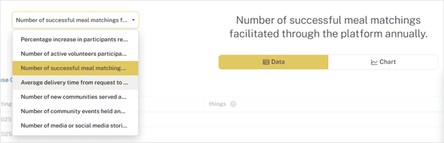
Dropdown menu navigation on the indicator data table screen lets you navigate between indicators without returning to the Logframe landing page.
Impact Measurement Project Dimensions Added to Project Elements
One last feature that we’ve added to streamline the indicator setup experience is automatically turning all dimensions and disaggregates created at the project level into Project Elements dimensions. Plus, we’ve polished up the dimensions screen, to boot!
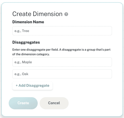
Revamped and cleaned up the screen for adding dimensions and disaggregates!
What does this all mean? If there are characteristics (i.e., dimensions and disaggregates) that you want to track in your project—and you want to track those same ones in other projects too, or maybe that thought isn’t even crossing your mind yet—add them directly to your project without thinking twice. By adding them to that project, they will ALSO be automatically added to your Project Elements-Dimensions library and, therefore, available for reuse in any of your other indicators in any b.world project at any point in time.
Why did we go through the trouble of making this adjustment in the platform? Because we listened to you—our users and prospective users—and gained clarity on how you and your fellow impact-focused organizations work. We learned that it can often be hard to know up front whether you’ll use an item in one project or across multiple projects, so it only made sense for b.world’s workflow to reflect this process.
You can still add dimensions and disaggregates directly to the Project Elements library, but it’s no longer necessary to do so to take advantage of reuse.
Now that we’ve added the “auto push” of dimensions from projects to Project Elements, our goal is to create the same functionality for the other logframe components (e.g., indicators, activities) to streamline the project workflow further.
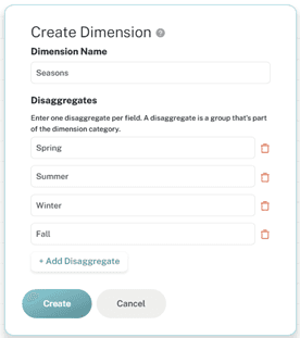
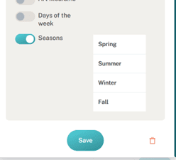
Creating a new dimension with disaggregates on a project (top image), and seeing what you just created within the indicator’s setup panel (bottom image).
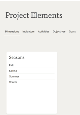
New dimensions and disaggregates added to a project indicator appear in Project Elements.
Impact Measurement Program Design: Create a Project and Whiteboard in One Fell Swoop
In continued efforts to streamline workflows in b.world so that users can get to value more quickly, we’ve added an one Easter egg to this release: it’s now possible to use our AI functionality to draft the initial project (i.e., project title, summary, challenge statement, and proposed solution) AND the project framework in the Whiteboard at the same time. And it’s as simple as checking a box (literally); when drafting a project via AI, all that users must do is select the option to ‘Design Your Project Visually’ before clicking Create Project.
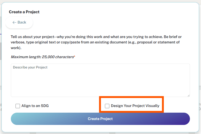
New option to also draft a Logframe in the Whiteboard when drafting a project via AI .
What's Next with Impact Measurement
In the coming months, look out 👀 for updates in b.world that:
Enhance data and document management
Improve stories
Further utilize AI to craft a more personalized experience
In the meantime, as always, we love to hear feedback—the good, the bad, and the ugly—from our users about our platform. The more we learn from our users, the better we can ensure that b.world aligns with your current and future needs and desires in project design, impact measurement, and storytelling.
For more immediate information: visit our website or LinkedIn Product Page