05
logo system
The threshold logo is a clear signal of who we are. These guidelines exist to protect its integrity and ensure consistency and clarity across every touchpoint as the brand grows.
logo
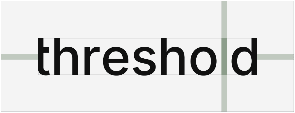
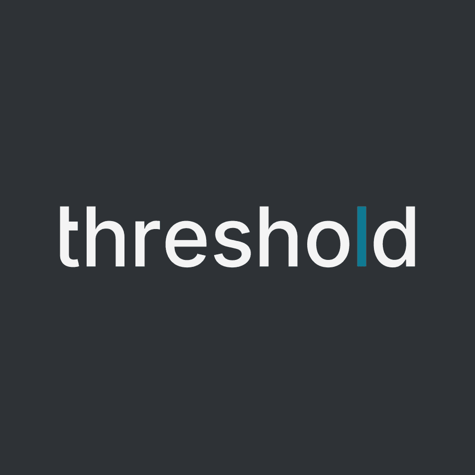
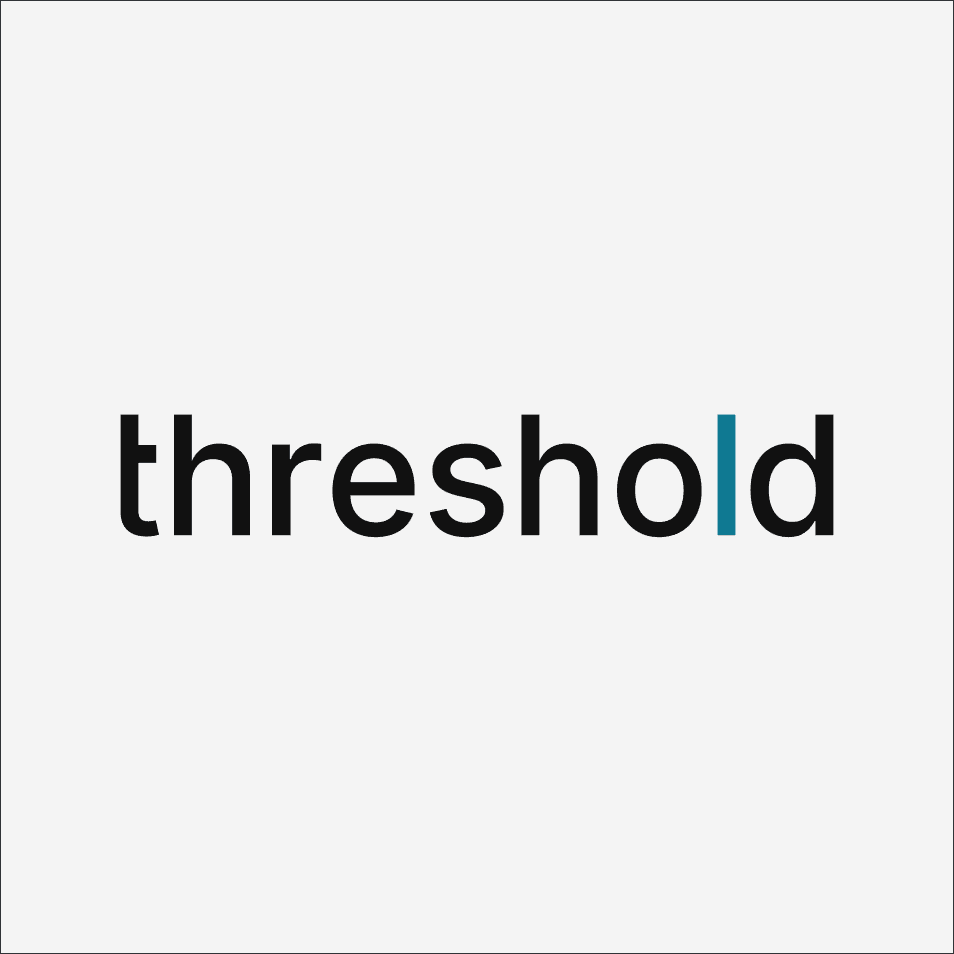
Our logo is a reflection of our name, threshold. It’s a wordmark that trusts language to carry the brand. No distractions. Just the name, balanced, occupying the same space as our dash, our story. The lowercase letters keep it human, humble and approachable.
An acknowledgment of those who came before us, building on the shoulders of the generations before, fueling us to build for the generations to come. The threshold logo is more than our signature. It’s the moment our belief in clarity becomes visible — a still point in a system in constant motion.

logo details
The missing arm of the "t" creates a subtle threshold within the word itself, a quiet nod to what we stand for - the lack of needing to protrude outside and become the centre. We occupy the complete space of our dash, no more.
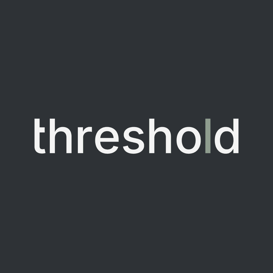
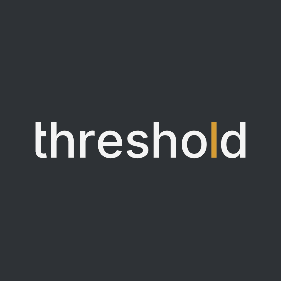
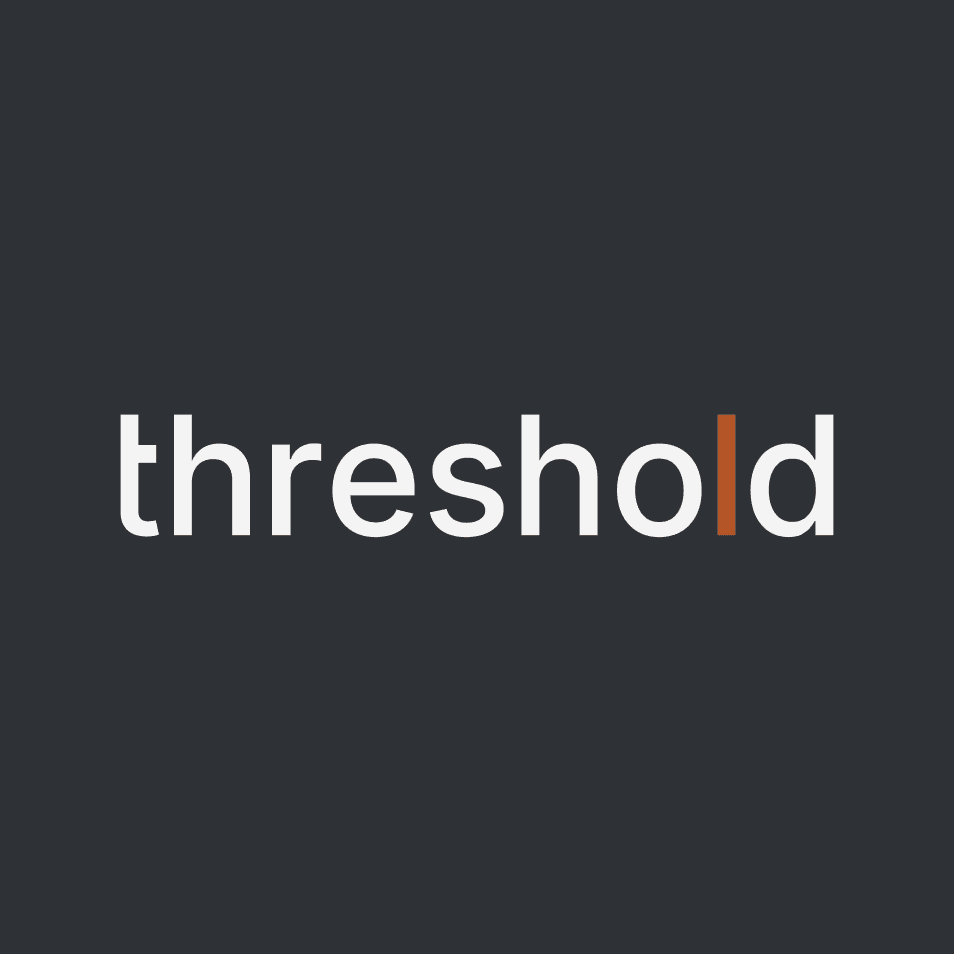
The illuminated "l" is the visual vessel for intention. It represents the exact moment where the thresholder's focus moves into meaningful action. Powered by the t.wo code, this subtle cue that allows thresholder's energy to push the mission forward.
This letter "l" in naked form, carries our core color, sage, as a deliberate mark that signals forward momentum and the crossing of a threshold.
Note: This "l" changes colors based on placement & purpose. Our design reflects our practices and our integrity, giving transparency and respect for/to those we serve.
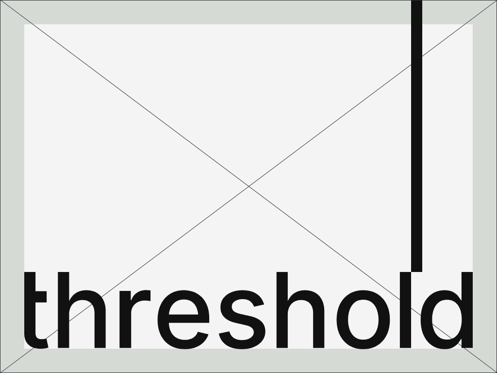
safe zones
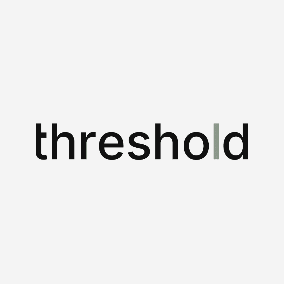
The exclusion zone preserves the logo’s clarity and impact by giving it space to stand on its own. The minimum clear space on all four sides is defined by the height of the dash and should be maintained in most situations.
color
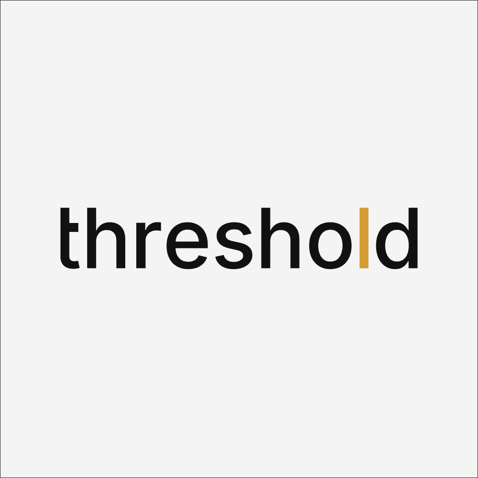
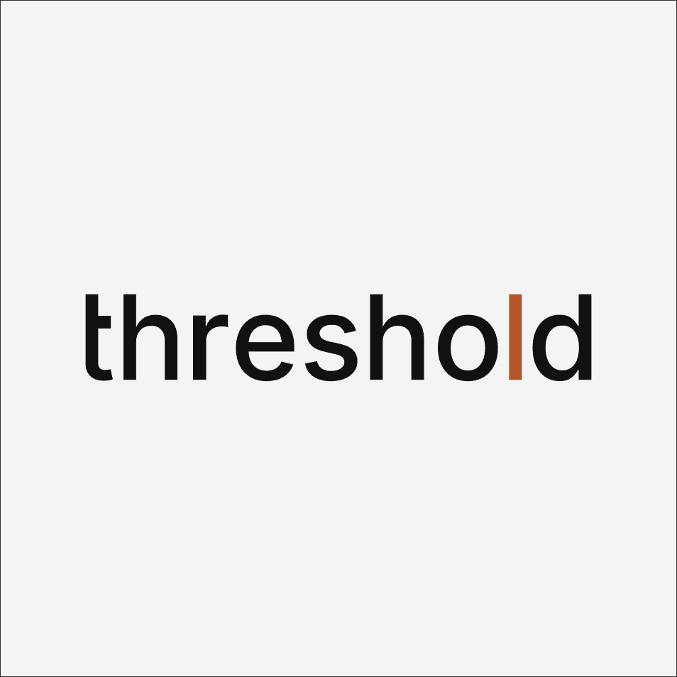
Understanding our color system helps ensure the threshold brand is represented with clarity and intention across every medium. Refer to the color specifications for precise values, and use the palette consistently to reinforce balance, trust, and purpose wherever the brand appears.
The default logo uses sage for the line. Accent colors are allowed with intention, not decoration, and only one at a time.
Smoke + Sage
BG: GUnmetal
Smoke + Earth
BG: GUnmetal
Smoke + Fire
BG: GUnmetal
Smoke + Ocean
BG: GUnmetal
Onyx + Sage
BG: Smoke
Onyx + Earth
BG: Smoke
Onyx + Fire
BG: Smoke
Onyx + Ocean
BG: Smoke
logo placement
The threshold logo anchors the layout. It aligns to edges and structure, not decoration. Placement favors clarity, balance, and restraint, allowing the work to lead and the brand to hold its ground.
icon
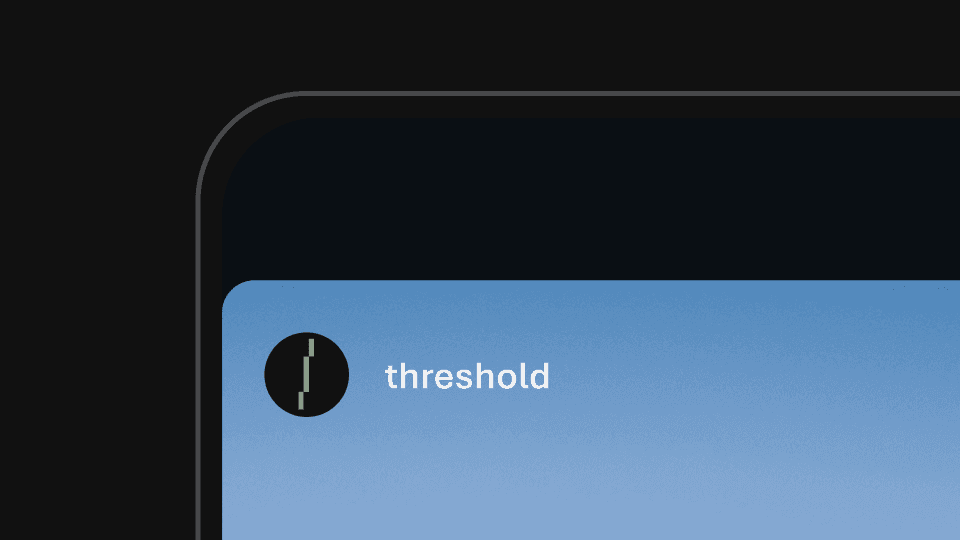
The icon distills threshold to its most essential signal. Drawn from the wordmark itself, it represents a moment of crossing, a pause between states, a quiet assertion of intent. Simple, flexible, and unmistakably threshold, it carries the brand when the full name steps back.


how it works
Use in small spaces only: social, avatars, favicons.
Keep it upright, centered, and uncluttered.
Apply threshold colors or neutrals only.
Let it signal presence, not replace the wordmark.
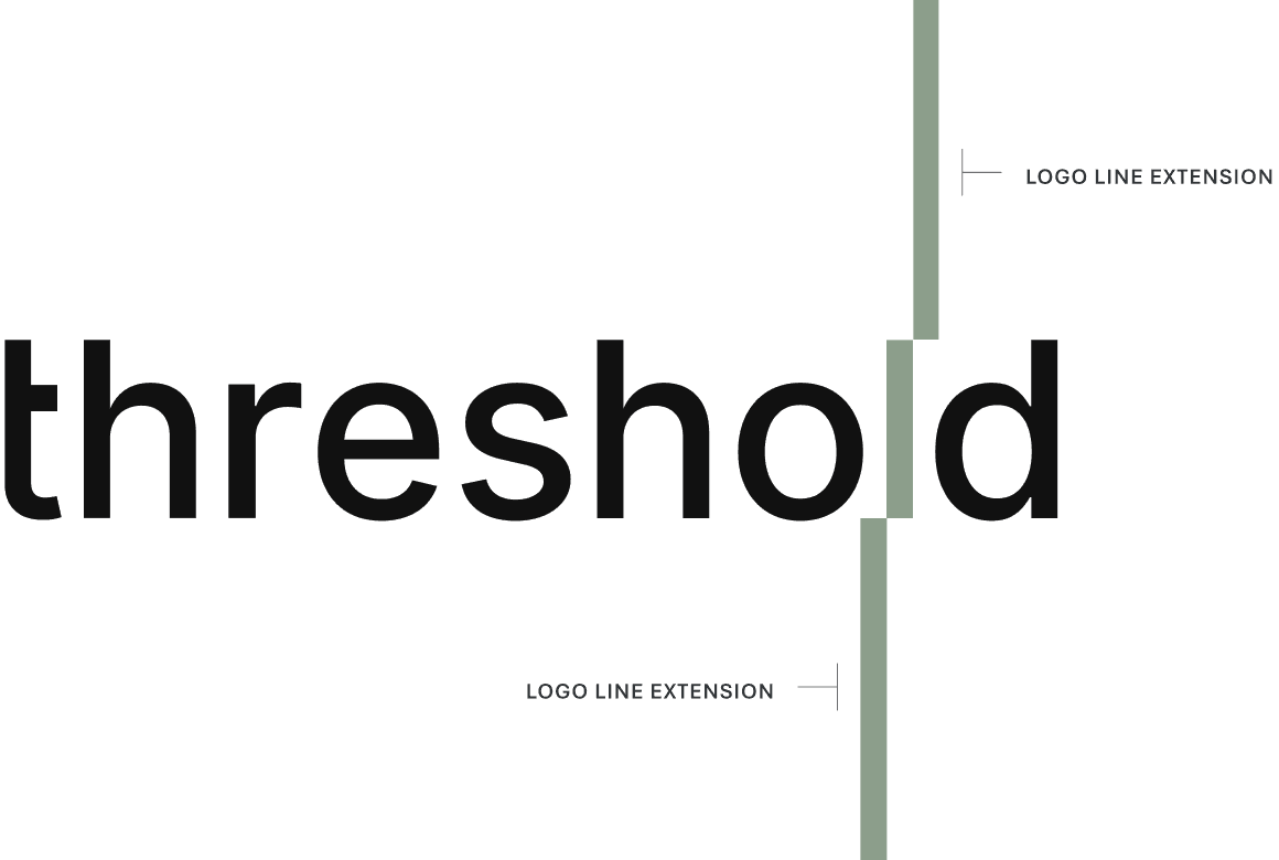
the line
The line is the visible embodiment of human expertise. It is the single, dynamic system that transforms intangible knowledge into measurable certainty. Technology moves missions, but the threshold line keeps them moving in the right direction.
how it works
The threshold line is the hero. It rises from the logo, separating chaos from clarity and marking progress as it moves upward.
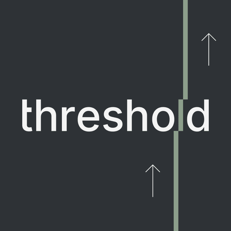
There is a change in reading order. Do not think of the line as running top to bottom. Think of it as rising from the threshold logotype.
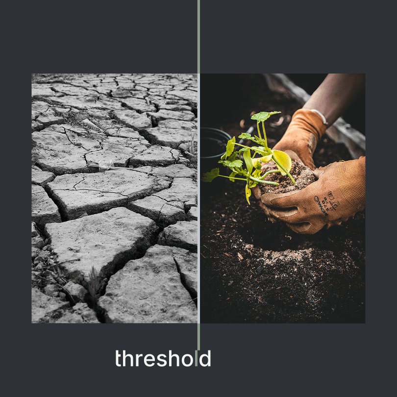
The line may run the full length of a composition, separating chaos from clarity.

Use the line to create structure across layouts.
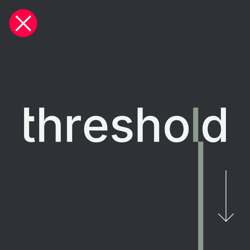
The line never goes downward. It always represents ascent and advancement.
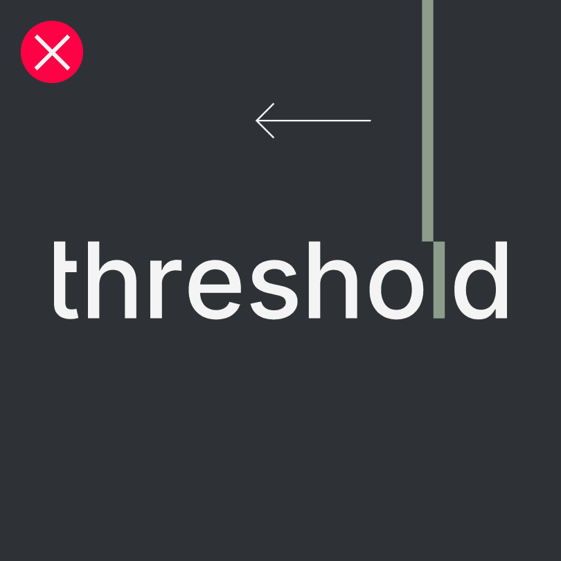
The line never goes backward, visually confirming positive progress.
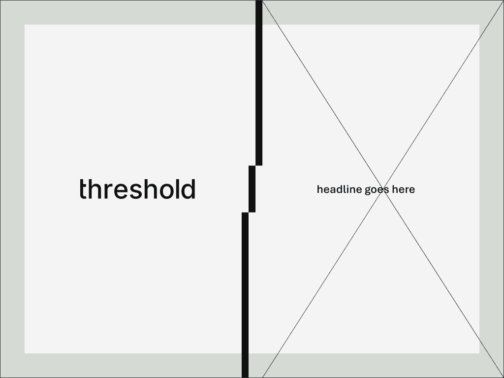
partnerships
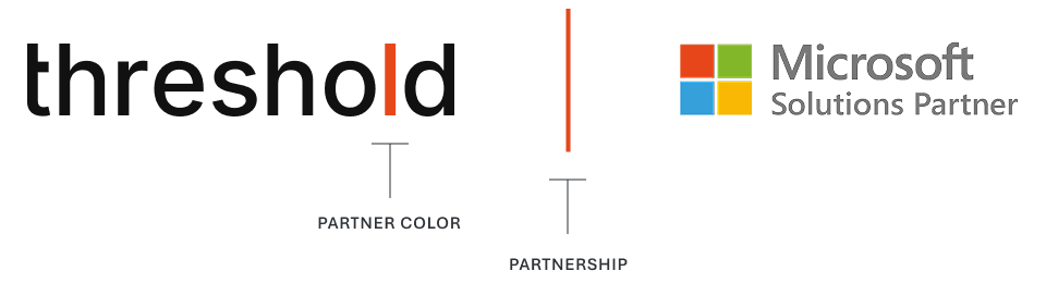
threshold was built to collaborate. Every partnership is an alignment of trust, a shared mission, and a continuation of good. The logo stays grounded while allowing collaboration through color, expressing togetherness without competing for attention.
usage notes
threshold stays on the left and anchors the lockup.
Align both logos on a shared baseline.
Separator height equals two lowercase “l” heights.
Total distance from threshold to partner equals three “l” heights.
Separator and line adopt the partner’s brand color.
Partner logo area is a guide. When constraints require adjustment, scale as needed, but maintain clear space and optical balance.
download assets
threshold logo suite
logo system, threshold logo, wordmark, logo guidelines, logo integrity, brand consistency, logo usage, logo suite, download assets
logo details, missing arm of the t, illuminated l, core color sage, t.wo code, dash, wordmark meaning
safe zones, exclusion zone, clear space, minimum clear space, logo protection, spacing rules
color system, color specifications, smoke, sage, earth, fire, ocean, onyx, gunmetal, brand palette, color combinations
logo placement, layout structure, alignment, margins, structure not decoration
icon, threshold icon, favicon, avatar, social icon, small space usage, icon guidelines
the line, logo line extension, rising line, ascent, forward momentum, visual structure, separator line, upward movement
partnerships, co-branding, partner color, Microsoft Solutions Partner example, partner lockup, collaboration system, usage notes
05
logo system
The threshold logo is a clear signal of who we are. These guidelines exist to protect its integrity and ensure consistency and clarity across every touchpoint as the brand grows.
logo
Our logo is a reflection of our name, threshold. It’s a wordmark that trusts language to carry the brand. No distractions. Just the name, balanced, occupying the same space as our dash, our story. The lowercase letters keep it human, humble and approachable.
An acknowledgment of those who came before us, building on the shoulders of the generations before, fueling us to build for the generations to come. The threshold logo is more than our signature. It’s the moment our belief in clarity becomes visible — a still point in a system in constant motion.
logo details
The missing arm of the "t" creates a subtle threshold within the word itself, a quiet nod to what we stand for - the lack of needing to protrude outside and become the centre. We occupy the complete space of our dash, no more.
The illuminated "l" is the visual vessel for intention. It represents the exact moment where the thresholder's focus moves into meaningful action. Powered by the t.wo code, this subtle cue that allows thresholder's energy to push the mission forward.
This letter "l" in naked form, carries our core color, sage, as a deliberate mark that signals forward momentum and the crossing of a threshold.
Note: This "l" changes colors based on placement & purpose. Our design reflects our practices and our integrity, giving transparency and respect for/to those we serve.
safe zones
The exclusion zone preserves the logo’s clarity and impact by giving it space to stand on its own. The minimum clear space on all four sides is defined by the height of the dash and should be maintained in most situations.
color
Understanding our color system helps ensure the threshold brand is represented with clarity and intention across every medium. Refer to the color specifications for precise values, and use the palette consistently to reinforce balance, trust, and purpose wherever the brand appears.
The default logo uses sage for the line. Accent colors are allowed with intention, not decoration, and only one at a time.
Smoke + Sage
BG: GUnmetal
Smoke + Earth
BG: GUnmetal
Smoke + Fire
BG: GUnmetal
Smoke + Ocean
BG: GUnmetal
Onyx + Sage
BG: Smoke
Onyx + Earth
BG: Smoke
Onyx + Fire
BG: Smoke
Onyx + Ocean
BG: Smoke
logo placement
The threshold logo anchors the layout. It aligns to edges and structure, not decoration. Placement favors clarity, balance, and restraint, allowing the work to lead and the brand to hold its ground.
icon
The icon distills threshold to its most essential signal. Drawn from the wordmark itself, it represents a moment of crossing, a pause between states, a quiet assertion of intent. Simple, flexible, and unmistakably threshold, it carries the brand when the full name steps back.
how it works
Use in small spaces only: social, avatars, favicons.
Keep it upright, centered, and uncluttered.
Apply threshold colors or neutrals only.
Let it signal presence, not replace the wordmark.
the line
The line is the visible embodiment of human expertise. It is the single, dynamic system that transforms intangible knowledge into measurable certainty. Technology moves missions, but the threshold line keeps them moving in the right direction.
how it works
The threshold line is the hero. It rises from the logo, separating chaos from clarity and marking progress as it moves upward.
There is a change in reading order. Do not think of the line as running top to bottom. Think of it as rising from the threshold logotype.
The line may run the full length of a composition, separating chaos from clarity.
Use the line to create structure across layouts.
The line never goes downward. It always represents ascent and advancement.
The line never goes backward, visually confirming positive progress.
partnerships
threshold was built to collaborate. Every partnership is an alignment of trust, a shared mission, and a continuation of good. The logo stays grounded while allowing collaboration through color, expressing togetherness without competing for attention.
usage notes
threshold stays on the left and anchors the lockup.
Align both logos on a shared baseline.
Separator height equals two lowercase “l” heights.
Total distance from threshold to partner equals three “l” heights.
Separator and line adopt the partner’s brand color.
Partner logo area is a guide. When constraints require adjustment, scale as needed, but maintain clear space and optical balance.
download assets
threshold logo suite
logo system, threshold logo, wordmark, logo guidelines, logo integrity, brand consistency, logo usage, logo suite, download assets
logo details, missing arm of the t, illuminated l, core color sage, t.wo code, dash, wordmark meaning
safe zones, exclusion zone, clear space, minimum clear space, logo protection, spacing rules
color system, color specifications, smoke, sage, earth, fire, ocean, onyx, gunmetal, brand palette, color combinations
logo placement, layout structure, alignment, margins, structure not decoration
icon, threshold icon, favicon, avatar, social icon, small space usage, icon guidelines
the line, logo line extension, rising line, ascent, forward momentum, visual structure, separator line, upward movement
partnerships, co-branding, partner color, Microsoft Solutions Partner example, partner lockup, collaboration system, usage notes
05
logo system
The threshold logo is a clear signal of who we are. These guidelines exist to protect its integrity and ensure consistency and clarity across every touchpoint as the brand grows.
logo
Our logo is a reflection of our name, threshold. It’s a wordmark that trusts language to carry the brand. No distractions. Just the name, balanced, occupying the same space as our dash, our story. The lowercase letters keep it human, humble and approachable.
An acknowledgment of those who came before us, building on the shoulders of the generations before, fueling us to build for the generations to come. The threshold logo is more than our signature. It’s the moment our belief in clarity becomes visible — a still point in a system in constant motion.
logo details
The missing arm of the "t" creates a subtle threshold within the word itself, a quiet nod to what we stand for - the lack of needing to protrude outside and become the centre. We occupy the complete space of our dash, no more.
The illuminated "l" is the visual vessel for intention. It represents the exact moment where the thresholder's focus moves into meaningful action. Powered by the t.wo code, this subtle cue that allows thresholder's energy to push the mission forward.
This letter "l" in naked form, carries our core color, sage, as a deliberate mark that signals forward momentum and the crossing of a threshold.
Note: This "l" changes colors based on placement & purpose. Our design reflects our practices and our integrity, giving transparency and respect for/to those we serve.
safe zones
The exclusion zone preserves the logo’s clarity and impact by giving it space to stand on its own. The minimum clear space on all four sides is defined by the height of the dash and should be maintained in most situations.
safe zones
The exclusion zone preserves the logo’s clarity and impact by giving it space to stand on its own. The minimum clear space on all four sides is defined by the height of the dash and should be maintained in most situations.
color
Understanding our color system helps ensure the threshold brand is represented with clarity and intention across every medium. Refer to the color specifications for precise values, and use the palette consistently to reinforce balance, trust, and purpose wherever the brand appears.
The default logo uses sage for the line. Accent colors are allowed with intention, not decoration, and only one at a time.
Smoke + Sage
BG: GUnmetal
Smoke + Earth
BG: GUnmetal
Smoke + Fire
BG: GUnmetal
Smoke + Ocean
BG: GUnmetal
Onyx + Sage
BG: Smoke
Onyx + Earth
BG: Smoke
Onyx + Fire
BG: Smoke
Onyx + Ocean
BG: Smoke
logo placement
The threshold logo anchors the layout. It aligns to edges and structure, not decoration. Placement favors clarity, balance, and restraint, allowing the work to lead and the brand to hold its ground.
logo placement
The threshold logo anchors the layout. It aligns to edges and structure, not decoration. Placement favors clarity, balance, and restraint, allowing the work to lead and the brand to hold its ground.
icon
The icon distills threshold to its most essential signal. Drawn from the wordmark itself, it represents a moment of crossing, a pause between states, a quiet assertion of intent. Simple, flexible, and unmistakably threshold, it carries the brand when the full name steps back.
how it works
Use in small spaces only: social, avatars, favicons.
Keep it upright, centered, and uncluttered.
Apply threshold colors or neutrals only.
Let it signal presence, not replace the wordmark.
how it works
Use in small spaces only: social, avatars, favicons.
Keep it upright, centered, and uncluttered.
Apply threshold colors or neutrals only.
Let it signal presence, not replace the wordmark.
the line
The line is the visible embodiment of human expertise. It is the single, dynamic system that transforms intangible knowledge into measurable certainty. Technology moves missions, but the threshold line keeps them moving in the right direction.
how it works
The threshold line is the hero. It rises from the logo, separating chaos from clarity and marking progress as it moves upward.
how it works
The threshold line is the hero. It rises from the logo, separating chaos from clarity and marking progress as it moves upward.
There is a change in reading order. Do not think of the line as running top to bottom. Think of it as rising from the threshold logotype.
The line may run the full length of a composition, separating chaos from clarity.
Use the line to create structure across layouts.
The line never goes downward. It always represents ascent and advancement.
The line never goes backward, visually confirming positive progress.
partnerships
threshold was built to collaborate. Every partnership is an alignment of trust, a shared mission, and a continuation of good. The logo stays grounded while allowing collaboration through color, expressing togetherness without competing for attention.
usage notes
threshold stays on the left and anchors the lockup.
Align both logos on a shared baseline.
Separator height equals two lowercase “l” heights.
Total distance from threshold to partner equals three “l” heights.
Separator and line adopt the partner’s brand color.
Partner logo area is a guide. When constraints require adjustment, scale as needed, but maintain clear space and optical balance.
download assets
logo system, threshold logo, wordmark, logo guidelines, logo integrity, brand consistency, logo usage, logo suite, download assets
logo details, missing arm of the t, illuminated l, core color sage, t.wo code, dash, wordmark meaning
safe zones, exclusion zone, clear space, minimum clear space, logo protection, spacing rules
color system, color specifications, smoke, sage, earth, fire, ocean, onyx, gunmetal, brand palette, color combinations
logo placement, layout structure, alignment, margins, structure not decoration
icon, threshold icon, favicon, avatar, social icon, small space usage, icon guidelines
the line, logo line extension, rising line, ascent, forward momentum, visual structure, separator line, upward movement
partnerships, co-branding, partner color, Microsoft Solutions Partner example, partner lockup, collaboration system, usage notes