06
typography
Typography is one of the primary ways our voice takes shape. It brings structure, tone, and rhythm to the brand, ensuring ideas are communicated with clarity, intention, and consistency across every touchpoint.
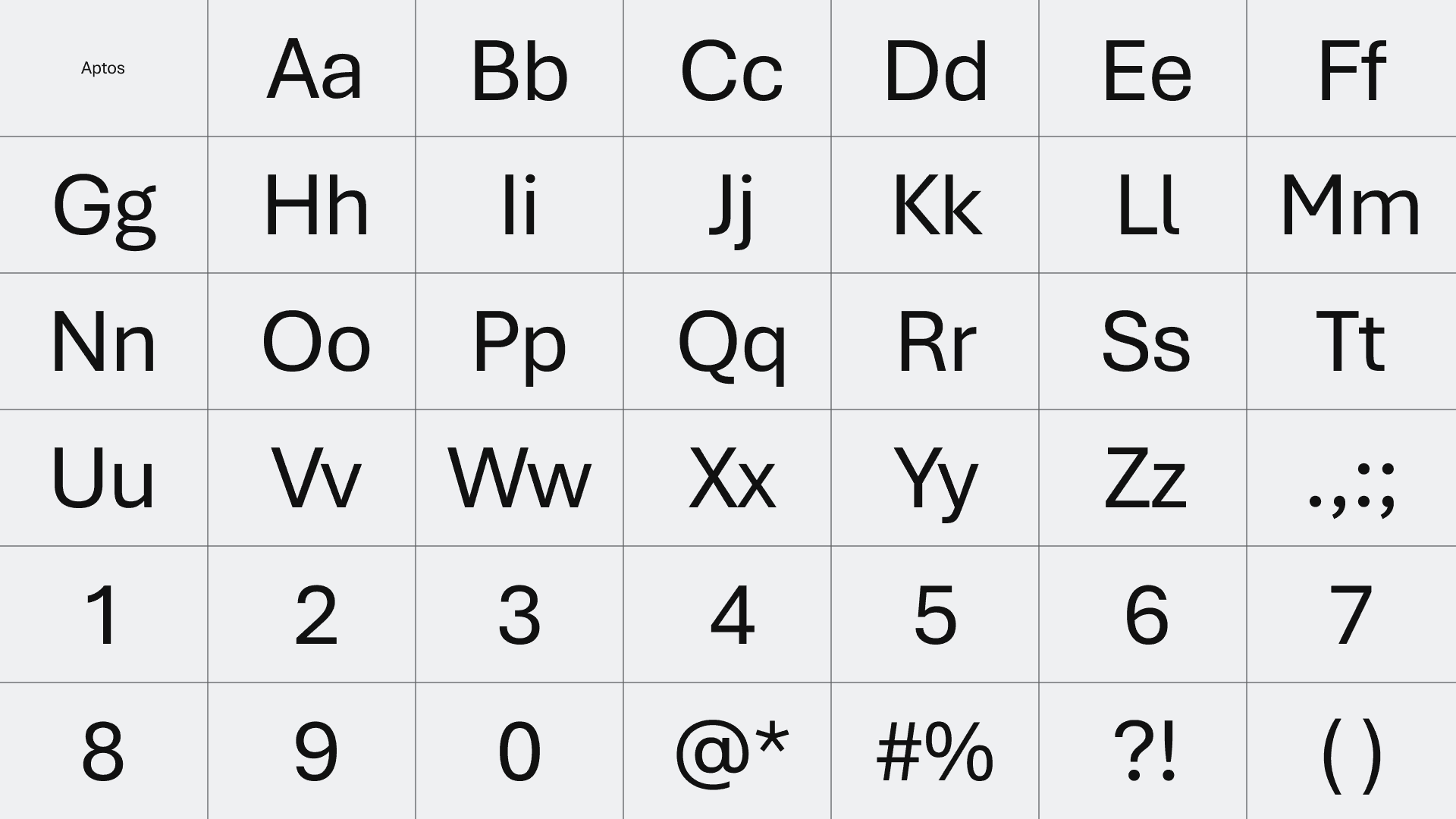
typeface
Aptos was selected for its balance of precision and warmth. Its clean forms and contemporary character support clear communication while remaining approachable and human. Used in Regular and Semibold weights, it provides flexibility while maintaining a cohesive and confident presence.
weights & styles
To maintain coherence and clarity, we take a restrained approach to font weights and styles. Within the Aptos family, Regular and Semibold are used intentionally to create hierarchy and emphasis while preserving a consistent and focused typographic voice.
Headlines - Aptos Semibold
we believe in a world where humans are empowered to create a regenerative future
Subhead - Aptos Semibold
We partner with the for-purpose sector to design and build solutions that make progress possible by unifying, automating and connecting the work behind the work.
Body text - Aptos Regular
Today, we choose to exclusively build on Microsoft and OpenAI platforms with the Common Data Model for Nonprofits as our design foundation. Over the years, our solutions have helped our customers raise more than $9B and support tens of millions of program stakeholders.
typeface settings
use case
weight
size
tracking
leading
Display / Hero
Semibold
64–96 px
-2%
110%
Section Headline
Semibold
32–48 px
-2%
110%
Subhead
Semibold
18–24 px
-2%
110%
Body Copy
Regular
14–16 px
0%
120%
Caption / Meta
Regular
12–13 px
+2%
135%
Typography lives across screens and print, but the intent stays the same. This chart translates our core Aptos settings across tools and formats, preserving rhythm, density, and tone. Use it as a quick reference to keep type feeling consistent, regardless of medium.
use case
screen (px)
print (pt)
tracking
leading
Display / Hero
64–96
48–72
−2% / −20
110% / ×1.10
Section Headline
32–48
24–36
−2% / −20
110% / ×1.10
Subhead
18–24
14–18
−2% / −20
110% / ×1.10
Body Copy
14–16
10–12
0% / 0
120% / ×1.20
Caption / Meta
12–13
9–10
+2% / +20
135% / ×1.35
type in practice
Use scale to establish hierarchy before introducing changes in weight.
Limit the number of weights used on a page to maintain clarity and focus.
Keep headlines concise. When space is limited, adjust tracking before increasing weight.
Prioritize readability in long-form text. If copy feels dense, increase leading rather than reducing size.
Maintain consistent spacing relationships across similar text types.
Avoid decorative use of typography. Every variation should serve meaning or structure.
When in doubt, choose simplicity. Consistency builds trust over time.
download assets
threshold typefaces
typography, Aptos, typeface, Regular, Semibold, type hierarchy, display hero, section headline, subhead, body copy, caption meta, tracking, leading, kerning, line height, letter spacing, screen settings, print settings, typography guidelines, readability, consistency
06
typography
Typography is one of the primary ways our voice takes shape. It brings structure, tone, and rhythm to the brand, ensuring ideas are communicated with clarity, intention, and consistency across every touchpoint.
typeface
Aptos was selected for its balance of precision and warmth. Its clean forms and contemporary character support clear communication while remaining approachable and human. Used in Regular and Semibold weights, it provides flexibility while maintaining a cohesive and confident presence.
weights & styles
To maintain coherence and clarity, we take a restrained approach to font weights and styles. Within the Aptos family, Regular and Semibold are used intentionally to create hierarchy and emphasis while preserving a consistent and focused typographic voice.
Headlines - Aptos Semibold
we believe in a world where humans are empowered to create a regenerative future
we believe in a world where humans are empowered to create a regenerative future
Subhead - Aptos Semibold
We partner with the for-purpose sector to design and build solutions that make progress possible by unifying, automating and connecting the work behind the work.
We partner with the for-purpose sector to design and build solutions that make progress possible by unifying, automating and connecting the work behind the work.
Body text - Aptos Regular
Today, we choose to exclusively build on Microsoft and OpenAI platforms with the Common Data Model for Nonprofits as our design foundation. Over the years, our solutions have helped our customers raise more than $9B and support tens of millions of program stakeholders.
typeface settings
use case
weight
size
tracking
leading
Display / Hero
Semibold
64–96 px
-2%
110%
Section Headline
Semibold
32–48 px
-2%
110%
Subhead
Semibold
18–24 px
-2%
110%
Body Copy
Regular
14–16 px
0%
120%
Caption / Meta
Regular
12–13 px
+2%
135%
Typography lives across screens and print, but the intent stays the same. This chart translates our core Aptos settings across tools and formats, preserving rhythm, density, and tone. Use it as a quick reference to keep type feeling consistent, regardless of medium.
use case
screen (px)
print (pt)
tracking
leading
Display / Hero
64–96
48–72
−2% / −20
110% / ×1.10
Section Headline
32–48
24–36
−2% / −20
110% / ×1.10
Subhead
18–24
14–18
−2% / −20
110% / ×1.10
Body Copy
14–16
10–12
0% / 0
120% / ×1.20
Caption / Meta
12–13
9–10
+2% / +20
135% / ×1.35
type in practice
Use scale to establish hierarchy before introducing changes in weight.
Limit the number of weights used on a page to maintain clarity and focus.
Keep headlines concise. When space is limited, adjust tracking before increasing weight.
Prioritize readability in long-form text. If copy feels dense, increase leading rather than reducing size.
Maintain consistent spacing relationships across similar text types.
Avoid decorative use of typography. Every variation should serve meaning or structure.
When in doubt, choose simplicity. Consistency builds trust over time.
download assets
typography, Aptos, typeface, Regular, Semibold, type hierarchy, display hero, section headline, subhead, body copy, caption meta, tracking, leading, kerning, line height, letter spacing, screen settings, print settings, typography guidelines, readability, consistency